Tuesday, February 5, 2013

Interface with only Sound


Daniel Flaquinti - 100393621

For this week’s blog I will describe how I would make an interface that would be useable by only using sound. This could be used for someone who has vision problems and cannot see the visual part of an interface. An interface to meet this requirement would be quite challenging to design as a lot to today’s interfaces rely strongly on the visual aspect. For example, all the menus and buttons for the iPhone require the person to be able to see and read the touch screen.

One piece that would help make the interface more accessible is the use of audio signals and indications. Sounds could be used to indicate to the user what kinds of different things are happening when using a device, such as a computer. For occurrences such as an error or system message, the computer could play a distinct tone that the user could easily recognize. To know what the message is saying, a synthesize voice could read the message to the user.  
      
Another challenge for the visually impaired user to overcome would be navigation with a mouse. To overcome this problem I would also rely on the use of sound. I would utilize some kind of speaker array that would allow the user to visualize where the mouse and different icons are on the screen. Small speakers could be placed around the computer or even under the LCD screen. For speakers that are placed under the screen, they would be organized in a grid type fashion. The speaker that would be behind the mouse cursor would play a very distinct and non-intrusive note. The user could listen for this sound and can use it to learn where the mouse cursor is on the screen. Multiple speakers can work in conjunction with fading to allow an accurate depiction of the mouse location with the sound. Other on screen items, such as icons and buttons, could also emit their own distinct sounds. This is so the user would know where they are as well. To click on one of the icons, the player would simply have to move the mouse to align the sound of the courser to the desired icon.  

Speakers could be placed behind the screen.

As mentioned earlier, the sounds these cursors and icons emit will be designed to be recognizable but not annoying. This would be critical for the design as the user would listening to the sound constantly when they are using the interface and they would also need to recognize them in an instant.

This kind of method would theoretically work as it will use the user’s ability to triangulate sound. Since humans have two ears, they can use the difference of the time the sound reaches each ear to locate the source of the sound. Through the speaker array, the user would find out the location of the different onscreen items by only using sound.  

[Picture of monitor]. (n.d.). Retrieved February 05, 2013, from http://gz-yitong.com/bigpic/20100305093838.jpg

Friday, January 25, 2013

Evolution of Video Game Controllers


Daniel Flaquinti - 100393621

          For this week’s blog post I will discuss the evolution of video game controllers and how I believe they evolved into what we use today. As mentioned in the lecture, one of the first ways of controlling a video game was a knob (or spinner). Commonly, the knob would control the movement of an on-screen block. This kind of input method only allowed movement was along one axis, essentially being one dimensional. This was fine for PONG and tennis style games, but did not allow enough control for more advance games. It was also common for knobs to be attached to the home game console, meaning the player would have to be holding the game system in their lap to play.

The controller was built into the console.
          
          Arcade games started to grow in terms of graphical capabilities and so did their control methods. Each game had custom controls designed and built for each specific game. Some used joysticks (Pac Man), buttons (Asteroids), trackballs (Missile Command), or steering wheels (Pole Position). Surprisingly, the world’s first game to use polygon graphics, I-Robot, only used a joystick as input.

Polygon graphics back in 1983.
         
          The second generation of home consoles gained the feature of having interchangeable cartridges, allowing for them to play more than their prebuilt games. This was problematic as the games could no longer have custom controls for each game (as they did in the arcade). All of the controllers were also separated from the system, allowing them to be held in the player hands. For the Atari 2600, many games had to utilize the primitive joystick and one button. Some games did utilize accessories, such as the keypad and paddle controllers (which still offers more control then a lot of other controllers I use today).  Many games in the Atari 2600’s library utilized the joystick to move and the button for a solitary action (such as moving and shooting). The Intellivision and Colecovision were very similar in design. They were not as easy to use, but used their extra buttons to their advantage. Menu selections could be made quite easily, such as inputting the computers level of difficulty. Games such as Discs of Tron used the Intellivision’s pressure sensitive disc to move in 8 directions and the keypad to fire in a different direction. Despite these extra buttons, a lot of games still only used the direction and action buttons.

Despite it looks, the disc does not spin.

          In the next generation of video games systems, the NES and Sega Master System took over the scene. Both systems abandoned the joystick for the iconic directional pad. This kind of design seemed necessary as it allowed for only one hand to move the character and free other to use more action buttons (the Atari 2600 joystick requires one hand to move the stick and the other to hold the bottom part of the controller). This design was first used on Nintendo’s Game and Watch systems, which required the movement commands of a joystick, but had to be flat so the system would be portable and foldable (on the two screen models). With more effective directional movement and more buttons, games for the NES and Master System were able to grow in complexity. Many games were able to use the two buttons to perform a wider array of actions, such as jump and attack. This also led to the creation of very popular franchises and establish well known genres.  

A very iconic controller and still one of the best ones I have used to this day.

          Meanwhile, arcade games were rapidly growing in complexity. They continued to add more and more buttons. The SNES, Genesis and Turbografx became the next generation of systems. These controllers were more comfortable to use and contained even more buttons. The Turbografx controllers included a built in turbo switch, allowing the buttons to be continuously pressed down and still continue to fire. Fighting games, such as Street Fighter and Mortal Kombat were becoming popular. The controllers of the game consoles were able to handle ports of the games as they included all of the buttons. After that generation came the rise of 3D polygons and movement in 3D space. Console manufactures had to make their controllers so the user would be able to navigate 3D space. Nintendo added an analog stick for precise movement in 360 degrees. They also added four yellow C buttons that would be used to control the camera, such as in Super Mario 64. Sony’s first version of their controller was very similar to the SNES’s. They later added two analog sticks to aid in the navigation of 3D space. Sega also started out with a very standard controller, but later made the “3D controller” for the Sega Saturn system with an analog stick. The next generation seemed to be a refinement of the previous generation. One change was that many console manufactures made the analog stick the main point of input as the D-pad took a lesser, smaller role in the controllers.

The analog stick was now the star of the show.

          One big change going into the next generation was the diversions of the different controllers. Sony and Microsoft controllers stayed pretty much the same. It was Nintendo that offered a new innovative controller with the Wiimote. The Wii’s controller could detect motion and was simpler to use then the “hardcore” controllers from Microsoft and Sony. Later in the cycle, Microsoft and Sony released their motion controls, the Kinect and PlayStation Move. These types of devices allowed for a more causal audience to enjoy gaming.    

Everyone got in on the action (except I don’t think anyone bought a PlayStation Move).

          As for the future I believe that controllers will continue to innovate, but will still have many of their roots tied to the past. For games to continue to have precise and effective controls, buttons, joysticks and analog sticks will still be necessary. New additions, such as a build in screen, biometrics and cameras will help enhance the experience of the overall game, possibly becoming a necessity in the future generations.   

The Wii U Gamepad adds something new, but still retains the buttons, D-pad and analog sticks. A perfect balance between old and new.


Saturday, January 19, 2013

How to make a User Friendly Interface

Author: Daniel Flaquinti - 100393621

For this week’s blog post I will be discussing how I would create an interface that would be useable to a mass amount of different users. The interface would be used for a tablet type device. The application would be used in a kind of business / home type of environment. One factor the interface would have to excel at is being user friendly. As mentioned in the video lecture, there are numerous things the interface must excel at in order to be user friendly. One of these categories is for the interface to be accessible and comprehensible.  To make the application easy to understand, I would limit the amount of buttons and options that would be on screen at once. This is to prevent the user from being overwhelmed by the options. The buttons would also be large and simplified, so they are easily legible and would still be usable if the application was to run on different devices. For example, the buttons must be usable if the application is being run on a tablet with a large screen or a smart phone with a smaller one. If the buttons were made too small, they might work fine for a tablet but might be hard to use of smart phone users. 

Another attribute I would do would be to label each button with text instead of using an image icon. This would be to make the application acceptable to people who are not familiar with application or technology in general. This would help make the interface accessible and idiot proof. For example, an elderly person might not know that a floppy disk symbol means to save what they are working on. If that button was replaced with a button that clearly stated “SAVE”, then the person would have a better understanding to what task and function that button performs. This is similar to how in the Nintendo Wii’s system menu; all the options are labeled and simplistic.

A very easy to use interface

To make the application further idiot proof, I would include a “HELP” button on each page. When pressed, a small description of what each button does would appear around the page. An overall description would also appear offering further explanation on what is happening in the application. There would also be audio that would narrate what the help descriptions are saying, as some people can take in information easier through audio. To make the application more available and ready, I would ensure that the application would be useable without an internet connection. This kind of offline mode would be very important as not all tablets and smart phones are connected to a network. For example I know a family member who owns a high end android smart phone, but does not have a data plan, meaning they can only use the internet if they are connected to a Wi-Fi network. If the application has internet functionality; I would ensure that the interface would still mostly function when not connected to a network. Essentially, the interface should work as much as possible without the presence of a network connection. Obviously this might be impossible if the application is totality internet based, but some effort should go into ensuing that it works as much as possible under a network free condition. With these ideas, an application could be created to have maximum user friendliness for anyone who uses it.     

Tuesday, January 15, 2013

Passion

Author: Daniel Flaquinti - 100393621
          
          When I was a young child I would always be creating and building different things. For example I had a toy play set that contained a plastic road and buildings. The roads would interlock, allowing me to create different layouts of cities. I also had a marble play set that allowed me to create different designs for the marble to run through (I wonder if you can guess which game I made must have had a massive influence from this toy). 


I had something similar to this as a child 


         Basically what I am trying to say is that I have always loved to be creative and think outside the box. I was never really satisfied with a simple toy that told you how to use it; I always wanted to create something different. I can even remember that at a young age I wanted to be a scientist / inventor when I grew up, so I could continually come up with new and cool ideas.

        As time went on I eventually started playing video games. I first games I played were on the Nintendo Entertainment System. These included titles such as Super Mario Bros and Tetris. I was captivated by the interactivity that games offered. They allowed me to explore their world and find the solution to problems. I became captivated by this and started shifting my focus to be more video game related. I was also gaining and interest with working with computers and technology in general. It was not until high school that I made the decision to go pursue video game development as a career. It combined my love for being creative, video games and technology into come comprehensive subject.

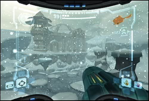
         Some of the games that really inspired me would be adventure style games, specifically Kirby’s Nightmare in Dreamland and Metroid Prime. The Kirby game showed me exploration and experimentation. Many of the levels contain secret places that could only be accessible by looking in hidden areas and thinking unconventionally. I was also able to experiment with Kirby’s many different types of powers. I was able to discover more uses for them by using them in different places. For example the laser ability will bounce off curved slops in the ice areas. Metroid Prime showed me how mood and atmosphere could effect a games presentation. The graphical fidelity and art style are still striking to this day. I remember always imagining what kind of different environments, monsters or discoveries lay around the next door. One part that sticks out to me was when I first entered the snow area in the game. It was so different than anywhere else I had explored and contained new enemies that I would have to learn how to defeat. I was also showed to some more clever uses of exploration and hidden secrets.


This area blew my mind


         I can safely say that I have made the right choice in choosing video game development as my career. Through this school I have learned to create different experiences for people to enjoy. One of the other factors that fuels my passion is knowing that what I am working on will be played and hopefully enjoyed by someone. That the work and dedication I pour into a project will eventually show through when someone plays the game. It was quiet rewarding during events like the GameCon as I got to see different players learn and explore the world I created. It was very rewarding to see the player get a sense of excitement and intrigue when they found some of the secret areas that I had hidden in the levels. I am now able to create my own games in which people can experimented and discover. It is truly rewarding to see your creation come to life and be enjoyed by others.   

Sunday, April 15, 2012

Final Post for Solitude GX

        The Game Con was a great success! I was a little sad that we did not win one of the prizes, but was still very happy with the feedback we got from the game. A lot of the people who played the game really enjoyed it. It seemed that once someone started to play our game, they kept playing for a couple of levels. We even hand players who got to the final boss! This meant that the game was able to hold their attention and that they were enjoying playing it. Players also got to try our older games, which helped show the team’s progression over the years.

        Overall I believe the levels in our latest game have been well designed. Everyone who played it knew exactly how to traverse the levels and what the objectives are. This was desfantyl made possible with the aid of iteration and playtesting. This shows that we have defiantly grown in terms of level designing. Over the summer I might even work on adding more levels, but I’ll have to see (most of the time things come up and extra projects get delayed). Overall I am very happy how the game came out and am looking forward to a nice and relaxing summer.    

Saturday, April 7, 2012

Game Complete!

        As of now our game is 100% complete. We were able to get the last component, dead-reckoning, working in our game. Currently, a lot of our assignments are also almost complete. For purposes of the post-mortem presentation, I had to go take screenshots of very old builds of our game. It was astonishing to see just how far our game has come in terms of being visual and functional. I personally have learned a lot about game design though making this game. I learned when designing the levels and puzzles, I need to give some guidance to the player to help them understand what to do. Without this, players would get lost and frustrated, something no designer wants. For example, the puzzle with the buttons, I had simply put a faded black line, thinking the players would eventually get it. Unfortunately, I was thinking as a designer, not from the player’s perspective. When the player is first introduced to the puzzle, they have no idea what the buttons do, how many there are, that they need to be pushed in a certain order, etc. I had to start thinking from the player’s perspective in order to make the puzzle simple and accessible to all who play it. By adding the bright yellow arrows as well as a darker line, one would think that I am making the puzzle way to obvious, but actually it was necessary to do so. It made it easier for the player to not only discover the order, but to figure out how the entire puzzle worked. 


Its come a long way.

Saturday, March 31, 2012

Nearing the End

        We are coming to the end of the development for our game. So far I am very happy how it has come out. Many of the fixes we are currently adding to our game are visual ones. Once big addition was the inclusion of bump mapping. This is not being done in real time, but through baking the textures in Maya. This helps the game look more realistic as well as visually appealing. This also took design choices as some of the baking caused the textures to go dark. Some adjustments had to be made in order to keep the player from getting lost in the darkness. 

        As for the difficulty of the game, I feel we have hit a good balance, as I had my younger sister play the game and she was able to get to the last level without guidance (she mostly plays games such as Angry Birds and Bejeweled, so she is not an experienced gamer). A few last fixes includes added more of a spectacle to the victory screen, to help visually reward the player. Some arrows were also added in some levels to further convey the proper path. We are also ironing out any glitches that show their heads, such as one that caused the timer to keep counting down after the goal was reached. I am very confident that the game will be ready for the Level Up event on Monday, I hope people will enjoy playing the game as much as I have crafting it.          

Sunday, March 25, 2012

Playtesting Helps

With the Lightbox event coming up soon, we are trying to get our game polished as fast as we can. Luckily, we are currently at the playtesting stage and are trying to tweak the game so that it is as good as it can be. Some of the suggestions we had received hand to do with navigation, feedback and sound. There still seemed to be some parts of the levels that did not convey to the player where to go next. Some arrows were added to help guide the player though these parts. After a player finishes a level, the victory theme plays and the next level loads immediately. A suggestion we got was to congratulate the player more, to make them feel then just accomplished something. Currently, we have created a screen that will fade in that will not only congratulate the player, but will compare their time to the times of other players. 

        Lastly, we were given more suggestions about the sound of the game. Currently our games does have sound effects, but not that many of them. Currently, it is very difficult to find sounds as many online sources require money for their sound effects. Hopefully we will be able to find more sound effect and add them into the game to help the levels feel more alive. So are cracking noises have been added to the teeter totter and the AI’s give off a creepy computer sound when you get close to them. With about a week to go we will not be able to fix all the problems with our game, but we should be able to get it very close to fully complete.   

This now makes noise when you roll on it. 
            

Saturday, March 17, 2012

Helping the Player

       For this week, we had met with our professors to get their option on our game. Besides a few suggestions with shaders, one of the biggest issues they found was that our game did not guide / teach the player enough. At times they felt lost and did not know where to go when navigating the levels. Some of their suggestions were to add a kind of arrow prompt that would tell the player where to go next. We felt this was helping the play too much as it would take away a large portion of the challenge. Instead we are going to use small cut-scene at key points to help show the player where to go. 

      We are also going to raise the height of the camera so the player gets more of a view of the level. This means they will be able to see obstacles ahead and make navigation easier. We will also add a few arrows in the geometry and textures to guide the player, but not be too explicit. Lastly we will create a type of tutorial level that will teach the player the basics in a controlled environment. We felt that the first level might a bit difficult for new players to get use to the game, so the tutorial level will ease them into it so they are conformable and gain confidence to get though the levels.      

An example of small arrows to show the player the way to go.

Sunday, March 11, 2012

Paper Prototype

For this week I will explain how my group went about converting our game into a paper prototype. Unfortunately for us, our game was not the easiest one to try and convert into paper. Since it was physics based, we found in challenging to translate that mechanic into paper form. At first we were going to have some kind of formula for the player to figure out how many spaces they have moved based on the speed. This method was much too complicated for the paper prototype. Fortunately, I feel we have found a perfect mechanic for the paper game, that captures the physics based mechanic. For the game board, we drew an outline of a type of level that would be in our game. We include some hazards such as sharp curves, crushers, exploding rocks and moving platforms. The track was then divided up into different sections, placing each section into its own zone. This is similar to how we divided up the computer games levels for the respawning. Each section has its own attributes associated with it. The attributes will explain what the player needs to roll in order to get past that part of the level. The player can choose “fast”, “medium”, or “slow”. If it is a curved piece, the attributes might be “fast = 4”, “medium = 2” and “slow = 1”. This means if the player wished to pass that part going fast, they must roll a 4 or higher. Failing to do so, means they must restart that section over again. 

Furthermore, for every roll the player makes they gain “time tiles”. They get three if they roll slow, two if they roll medium and one if they roll fast. This will incline the player to risk going fast, hoping that they do not fail as they will have to gain more time tiles. The player who gets to the end of the track with the least amount of time titles wins. I feel this accurately reflects the strategy of the real game as player can risk going fast, meaning they might require multiple attempts, or go slow, but waste a lot of time. 

Saturday, March 3, 2012

Respawning Breakdown

For this blog post I will explain the process of deciding where and how to include the different spawn points throughout the levels in our game. As you have previously read, the player is able to respawn as soon as they fall off the track. They are spawned at a certain point further back to where they had fallen off. When deciding where to place these points, I try to mentally divide the level into different sections. For example, in the cave level, the long bumpy part of the track in one section, the teeter totter would be another section and the rock with the buttons is also a separate section. This means that if the player dies on the teeter totter, they are respawned at the beginning of the teeter totter. This separates the level into smaller chunks for players to tackle. When choosing the actually place for the player to respawn, I must also take certain precautions. I am sure to choose a spot that is safe and sturdy, such as in the middle of a flat service. This is to ensure that the player does not immediately die after respawning, that they have a chance to take in their surroundings. Places that would be an inappropriate choice would be on top of the teeter totter, right in front of a cliff etc. If a player were to spawn in those places, they would not have enough time to react. I also try to choose a place that the player has past by before. This prevents them from getting disoriented of where they had spawned. Usually the spot will be a on the path they took in order to get to that part of the section. This will help them recognize where they are and continue on their way.   


                                                Bad place to spawn.                

Saturday, February 18, 2012

Sub-games and rewards

This week I will be discussing some of the sub goals within our game. These goals are to lure the player from the standard “get to the end of the level” goal and to test very skilled players who are able to accomplish both tasks. Within the levels of our game are three objects that are hidden/very difficult to reach. Once they player has touch one of these objects, they will collect it. Collecting all the objects in a level will present the player with an unlockable. Most of the time to gain these objects is very difficult and requires the player to use a large amount of experimentation and exploration of the levels. Some involve the player to stray from the defined path to get to the end of the level. We feel that this mechanic will increase the life of the game as players can go back to previous levels in order to find all the hidden objects. This is a similar mechanic to what is used in Super Mario 3D Land with the star coins (http://www.youtube.com/watch?v=tHt5dOd7Gfs) and Batman Arkham Asylum with the Riddler Trophies. 

The type reward is unknown to the player, making it even more tantalizing to complete the challenge. This sub-game will also add a lot more depth to our game as the player must make the choice to either continue on their way through the level linearly or to try and acquire the objects. Some objects require the player to perform dangerous actions (such as rolling near the edge of the cliff) to be obtained. This will also add a sense of risk vs reward into the game, does they player risk possibly loosening a massive amount of time in order to gain the object to gain the reward?        

 Finding the trophies is a very fun sub game

Saturday, February 11, 2012

Designing Mechanics in a Level

In this blog post I will try to describe one of the mechanics I am implementing in one of the levels of my groups game. The mechanic allows the player to access faster as well as safer part of the track if they are able to meet certain conditions. One path involves pressing a hidden button to gain access to a faster, safer way though a part of the level. The longer path is actually quite dangerous, making the faster path even more desirable. The faster path has been placed purposely so that it is visible when the player uses the slower one. This will entice the player to discover how to reach the path. This will allow experienced players to uses these paths instead of the slower ones. It is also a way for the more experienced players to show off as in an online race, they can use these paths to gain advantages over inexperienced players. But once an experienced player uses these paths, they will reveal the method of unlocking them to the inexperienced player, allowing them to use it in the next round. This is similar to the shortcuts in Mario Kart, how the shortcuts gives advantage to the players who know them, but will also teach them to the players who don’t.  


                                                    Two different paths

The next path involves more skill then knowledge. The marble is dropped into a sort of pachinko machine. One of the three openings at the bottom leads to a faster path. The one that does is considerably smaller than the other two. The other two openings leads to a slower path. As I playtested this portion, I found that I was constantly falling into the slower paths. Eventually I was able to come up with a strategy of what pegs to hit. With this strategy I was able to make it into the faster hole. Obviously it will need more playtesting and iterations, but it is already functioning in terms of needing strategy and experience to access the faster paths.   

Sunday, February 5, 2012

Magic The Gathering Cards


For the Demon character, I made the cost only 1 black mana. That means he would get 2 from the black and 1 from the baseline, giving him a total of 3. I distributed it so he had 1 power and 2 toughness.  

Red Demon:
Black: 2
Card Baseline: 1

Total: 3


For the human solider character, I made his cost 2 white mana. First he receives a total of 4 points from the 2 whites, then 1 additional point from the baseline. Since his total is 5, he receives another point, making his total 6. I gave him 4 power and 2 toughness.    

Human Solider:
White: 2
White: 2
Card Baseline: 1
Cost of 5 or more: 1

Total: 6


The robot character receives 4 points from the black and green mana (2 points each). He also gets the 1 point from the baseline. Since he has reached 5 points he gets the additional bonus. Since he has a green mana, the bonus is 2 instead of 1. This makes his total 7. I allocated the points to give him 3 power and 4 toughness.   

Cyborg Killer:
Green: 2
Black: 2
Card Baseline: 1
Cost of 5 or more with green: 2

Total: 7 


Monday, January 30, 2012

Resources In Gradius


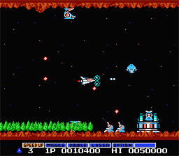
To make the game more balanced in terms of resources, I would modify the game so that all the power-ups and abilities are not lost when the player is hit. Currently, when the player is hit by only one enemy, they instantly die. Once they die, they must restart at the pervious check point and they lose all their pervious abilities.  This makes the game very difficult as the player must start from scratch with building up their ships abilities. I would change this rule to make it easier for the player. For example, when the player dies, maybe let the player keep all of their abilities. That way they can continue to build up their abilities instead of starting over.

Another way I would modify the game would be to not have the player die in one hit. Maybe have the player lose their strongest ability for every hit they receive. For example if the player had speed, double and laser abilities, they would lose the laser ability if hit once. If hit the second time they would lose the double ability and so forth. Once they have lost all their abilities, then they die in the usual manner. Personally, I feel that this method is more “fair” to the player as if they are hit; they have a greater chance to reclaim the more powerful abilities, instead of just losing everything. This would also help they player progress further into the games levels as the abilities would count as a kind of resource for the player to continue if hit (similar the mushroom in Super Mario Bros). With these extra resources the player will be more likely to reach the in-game checkpoint, making level progression faster.   


Changing RISK

For this assignment, we were to redesign the rules of risk into something that younger players would enjoy in terms of difficulty and play time length. This was co-written with my group members whose blogs can be found here: http://drolzjourney.blogspot.com/ and http://dreadgdp.blogspot.com/


Game Changes
- Remove the army pieces that aren’t worth one army.
- Reduce the number of territories; about 4 of each color.


Setup
- Each player choose a color army and their units start on the country of the same color. For example, the red player would start on the red country. Three armies are placed on each territory in the player’s color.


Play
- Every turn, one army is given to the current player and they can place it on any territory they own.
- The current player draws a card at the beginning of their turn and place one additional army on the territory marked on the card. If they don’t own the territory, then no armies are placed this turn.


Attack
- On the current player’s turn that is making an attack, they roll a die and the number on the die indicates how many armies the player can attack with.
- The players involved with a battle will each roll a die. The highest roll wins and the lower number loses one army involved in the battle. The battle is over when all of armies on one player’s side are gone.


Movement
- The current player rolls a die and can move the number of armies as indicated by the die roll.
- A player can move his armies to any place on the board as long as there are adjacent territories under his control between the source and the destination.
- The player can make an attack order when there is more than one army on the territory they’re attacking from. They must also be adjacent to a territory that is under enemy control.


Winning
- A winner is announced when all other player’s armies are destroyed.
- The game also ends when 30 minutes have gone by. The player with the most number of countries under their control wins. If there is more than one winner, then one final battle is done between the winning players to decided on an ultimate winner.

Saturday, January 14, 2012

Chez Dork Board Game

Name Of game: Chez Dork

Number of Players: 3

Time to play: 1 hour

Something I liked about the game was the humour in it. Most of the cards poked fun at geek and gaming culture. For example one card showed a video game called Final Adventure XVIII, which pokes fun of how many Final Fantasy games have been released. Another card made fun of how collectors never open or enjoy most of their collectable possessions. I also liked how you could sell cards to other players, which injected another layer of strategy into the game. For example you could attach a temporary obsession to a player then try to sell off items of that obsession to the player at a higher price. I also liked that the goal of the game was clear and straight forward.

Some of the different things I disliked about the game was that it was confusing to learn. My group had troubles trying to understand the difference between permanent and temporary obsessions. We also had trouble understanding what certain cards did. We found that the learning curve for the game was too large. It also did not help that we were only given an hour to play the game. Another thing I disliked about the game was at the fact that no fake money was provided. We had to use a separate piece of paper to keep track of each other’s money. This was somewhat annoying as player were constantly spending and receiving money throughout the entire game. Something as simple as Monopoly money is not expensive to manufacture, so I have no idea why it was not included. I also disliked that the amount of money you had in the end of the game did not matter, only the points counted. For example other board games might offer extra points if you had a lot of money left over.  

            Overall the game had a very solid design. One thing I would have made differently is the amount of money they player received at the beginning of their turn. I would have randomized it more than just having a set amount of 30 dollars. I might have included something like a dice or spinner that would either increase or decrease the amount of money each player receives at the beginning of their turn. There might be cards that do this, but we did not run into any. Another minor thing I would change would be for the temporary obsessions to have a time limit. After a set number of turns it would either be removed or switched to something else, to make the game feel more sporadic.

            There are not many rules in the game. The main objective is to gain money and to use it to purchase different card to earn points. The winner is the first to earn 25 points. The amount of points a card is worth can increase if it matches the players’ character’s obsession. For example a card with video games will be worth double if the characters obsession is video games. Each character starts with a permanent obsession, but is able to gain temporary ones. The temporary obsession can be added by the player or other players. You can also sell cards to other players that match their interests. Each turn the player received 30 dollars, they can use the money they accumulated to either buy cards from their hand or from other players. Each player has 5 cards in their hand, but must buy them to actually use them.          

Tuesday, December 13, 2011

Final Post

I was not sure if we needed to do another post, so I am going to do one just in case. Anyway the game came out great and I am looking forward to expanding it next semester. Hopefully the networking stuff will not be that difficult. I also hope we can find another artist to join our group as currently we have none. Anyway I am looking forward to finally going home for Christmas break and relaxing. I have a copy of Uncharted 2 sitting next to me (as well as a few other games) that I am dying to try out, but can't until the exams are done. Luckily I only have 6 days, 23 hours, 36 mins and 15 second before my last exam is done, but whose counting?        

Saturday, December 3, 2011

Finish!

The games due date is Monday, but thankfully my group and I have completed almost all of the requirements. The only issue is the animations. I kind of had them working in a test program, but the game crashes when using them. Other than that everything seems to be done and working in the game. I have even started studying for my exams to get an early start. All of my modeling, elective, and project management assignments are done. I have 50 XP right now, but am waiting to see if the partial system homework needs to be made with a tool or not. If not then I should be up to 65 XP. Overall I think the game turned out nicely. I am still kind of disappointing as  some of the things we wanted to add to the game where nearly working, but other homework and time restrains caused us not to finish them. The first semester game is always the toughest, especially when working with a new engine. Hopefully next semester we can fix up a lot of the messy code, implemented the things that where cut, add some more functionality to the engine and dive deeper into Havok. Anyway I am looking forward to finally revealing the game on Monday at the GDW presentations as well as improving it next semester.   

Saturday, November 26, 2011

Almost out of Time!!

My group is currently is crunch time has we are trying to get everything done for the game. Trying to get all the requirements done and working together is turning into a nightmare. Thankfully we only have a few more requirements left. We are going to be spending most of the time left to get them all done. The game is turning out pretty good, much better than our first semester game we made last year. Once the game is finally done I can relax for like 12 second before I have to start worrying about all my other homework. I had to set aside some of my other courses homework in order to work on the game. I still need to complete all of the IK stuff for my model, as well as all of the texturing, including normal and specular maps. 

The texture so far.  

I also need to properly UV map my level for the game. On top of that I still have homework for the game engine course as well as cybercrime and project management. Luckily all of these things are due a week after the game, so I should have time to get everything done. I am looking forward to Christmas break as I will finally get away from all this homework!!